


Importance of Graphic Design For Your Business

on Jan 15, 2020
Graphic design is important to every business and our everyday lives in many...
Clear your dues to time.
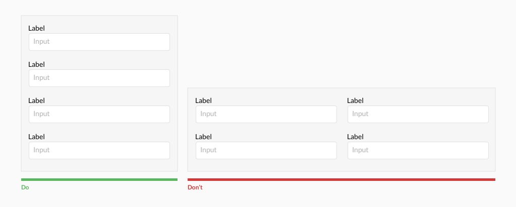
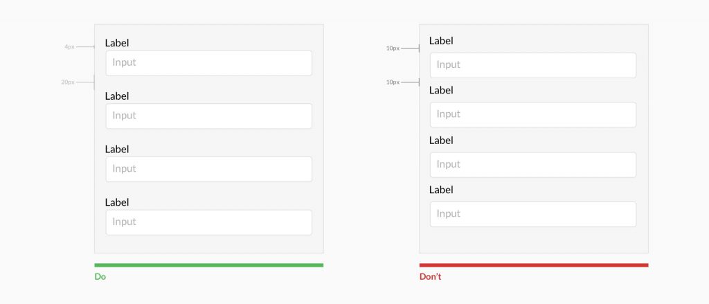
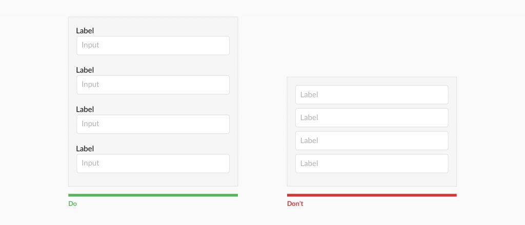
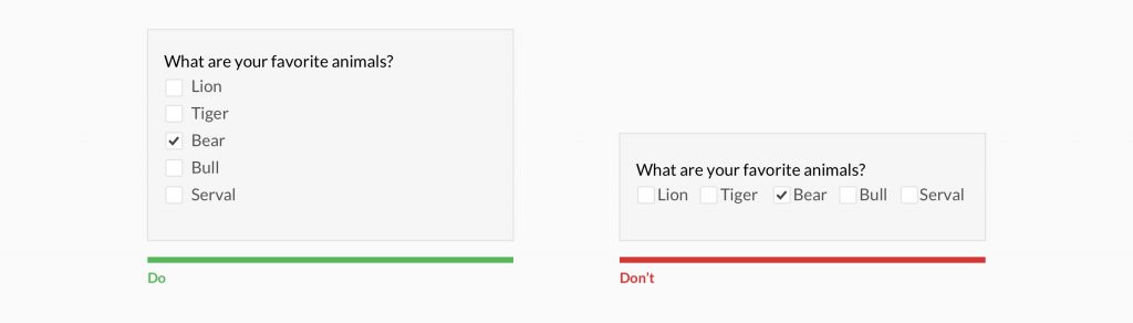
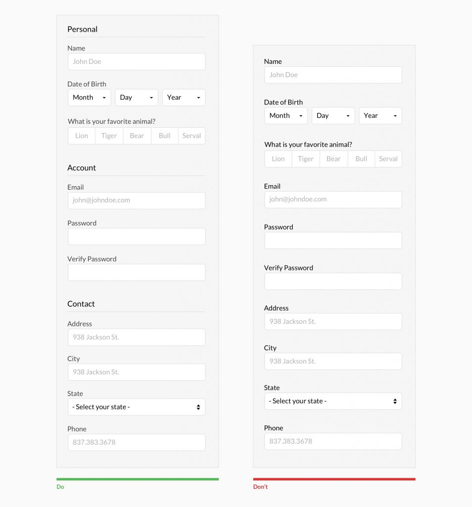
Forms are one of the most important components of digital product design. Whether it is a signup flow, a multi-view stepper, or a monotonous data entry interface. Forms are the way for lead generation.This article focuses on the common dos and don’ts of form design. Keep in mind that these are general guideline and there are exceptions to every rule.


Our design, coding and marketing courses with certificates attract renowned companies from across verticals


.png?width=130&height=53&name=image%2027%20(1).png)


.jpg)


.jpg?width=767&name=movie%20poster%20%20(option%202).jpg)


BOOK A FREE CONSULTATION