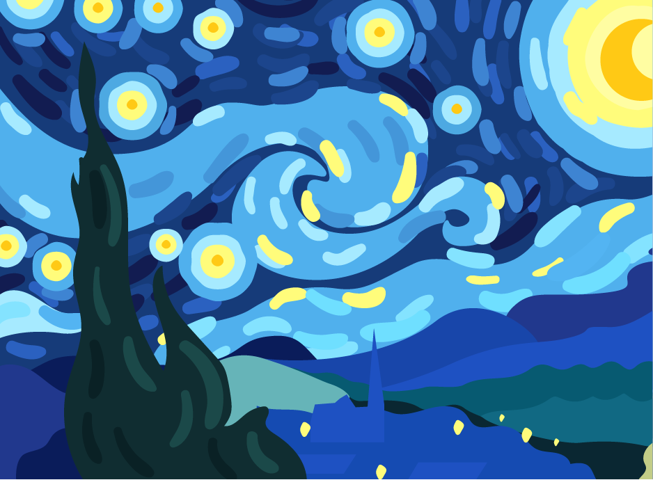
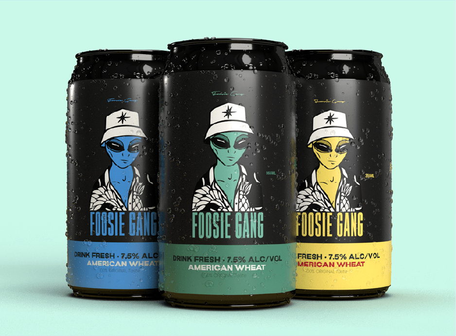
When it comes to graphic design, there are a lot of specialized terminologies. And if you’re just getting started in the field, it can all be a bit overwhelming. But don’t worry! In this blog post, we’ll introduce you to 15 essential pieces of graphic design terminology. By the end, you’ll have a much better understanding of the basics and be well on your way to mastering the craft. So without further ado, let’s get started!
#1 Bleeds
If you’re a graphic designer, chances are you’ve come across the term “bleed.” But what is a bleed, and why is it important? A bleed is simply an extension of your design past the edge of the page. For example, if you have a business card that is 3.5 inches wide by 2 inches tall, and you want the background colour to extend to the edge of the card, you would need to add a 0.125-inch bleed to each side of your design. That would make your final file size 3.75 inches wide by 2.25 inches tall.
Adding a bleed ensures that your design will print all the way correctly to the edge of the paper or cardstock. Without a bleed, there is a small risk that your design will be cut off-centre, resulting in an unprofessional-looking finished product. So, next time you’re designing something that will be printed, don’t forget to add bleeds!
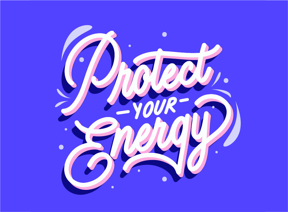
#2 Kerning
It is the process of adjusting the spacing between characters in a piece of text. It’s an important part of typography and can help to make your text more readable and visually appealing.
When kerning text, you’ll need to take into account the overall width of the characters, as well as their individual shapes. For example, you might want to increase the space between two wide characters or decrease the space between two characters that are close together.
There are a few different methods you can use to kern your text. You can do it manually, by adjusting the spacing between each character individually. Or, you can use a program like Adobe Illustrator or Photoshop to automatically kern your text for you.
No matter which method you choose, kerning is an important part of creating beautiful and easy-to-read text.
#3 Resolution
This refers to the number of pixels in an image and is typically expressed as DPI (dots per inch) or PPI (pixels per inch). Higher resolutions result in sharper images, but can also be more difficult to work with.
#4 Vector
A vector graphic is one that is created using mathematical equations, rather than pixels. This means that they can be scaled up or down without losing quality. They are often used for logos and illustrations.
#5 Raster
A raster graphic is made up of pixels, like a photograph. When enlarged, raster graphics can become pixelated or blurry. Raster graphics are best suited for web use, where file sizes need to be small.
#6 CMYK
CMYK is a colour model that is used in printing. CMYK stands for Cyan, Magenta, Yellow, and Black. These are the four colours that are used in printing. CMYK is a subtractive colour model, which means that it subtracts light from white to create the desired colour.
#7 DPI
DPI, or dots per inch, is a measure of the resolution of an image. The higher the DPI, the more detailed the image. A higher DPI will result in a better quality print when printing images. For web use, DPI isn’t as important, but images with a low DPI may appear blurry or pixelated on high-resolution screens.
#8 RGB
RGB stands for red, green, and blue. These are the three colours of light that are used to create all the other colours on a computer or television screen. When these colours are combined in different ways, they can create any colour that you can imagine.
#9 Web-safe colours
When it comes to colours, there are two types: web-safe and non-web-safe. Web-safe colours are those that can be displayed on all browsers and devices without issue. Non-web-safe colours, on the other hand, may display differently depending on the browser or device being used.
When choosing colours for your website or design, it’s always best to stick with web-safe options to avoid any potential issues.
#10 Favicons
Favicons are small icons that represent a website, brand, or individual. They can be used to improve the usability and branding of a website.
When designing a favicon, it is important to keep in mind that it should be recognizable even in small sizes. The icon should also be simple and easy to understand.
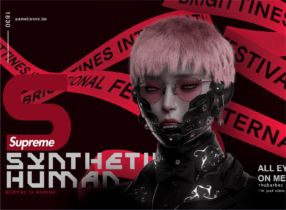
#11 Layout
Layout is one of the most important aspects of graphic design – it’s essentially the arrangement of elements on a page (or screen). A good layout will help to guide the viewer’s eye around the design, highlighting the most important parts in an effective way. There are a few key things to keep in mind when creating a layout:
– Balance: This refers to the distribution of elements on a page – too much of one thing can make a design look unbalanced and cluttered. Try to create a sense of balance by using different shapes, sizes and weights (light vs. dark colors, for example).
– Hierarchy: This is all about creating a visual hierarchy – making sure that the most important elements are given prominence and are easy to spot. You can do this through use of color, size, position and other design techniques.
– Negative space: This is the empty space around and between elements in a design. It’s often underestimated but negative space plays an important role in achieving balance and helping viewers to focus on specific elements.
– Alignment: All elements in a layout should be aligned in some way, whether that’s horizontally, vertically or diagonally. This creates a sense of order and makes designs look more polished and professional.
#12 Grid Systems
Grid systems are a fundamental part of graphic design. They provide a structure for designers to organize content in a logical and consistent way. There are many different types of grid systems, but the most common is the 3-column grid. This type of grid is used to create web pages and other digital content.
Grid systems help designers to create visually appealing and easy-to-use designs. They also make it easier to control the overall look of a design, as well as how individual elements are positioned within it.
#13 ‘Figma’ & ‘Sketch’ design software
“Figma” and “Sketch” are two of the most popular design software programs used by graphic designers and you can learn more about these tools in graphic designing course. While they both have their own unique set of features, they share a common goal: to help designers create beautiful, professional-looking designs.
Want to learn more about graphic designing?
Dice Academy is one of the leading institutes in Delhi NCR for graphics & web designing courses. We have highly qualified faculty members who perfectly mix hands-on instruction with real-world tasks to prepare students for the industry. Call 9508 222 111 or 1800 120 661 100 to know more about Graphics Design and Web Design courses by Dice Academy.


.png?width=146&height=46&name=image%2028%20(1).png)
.png?width=130&height=53&name=image%2027%20(1).png)
.png?width=229&height=20&name=image%2026%20(1).png)


.jpg)
BOOK A FREE CONSULTATION