Introduction
Typography is the art of arranging text to make it legible, clear, and visually appealing. More than just selecting a font, typography is about creating a visual language that enhances the readability and meaning of the text. From websites to print materials, typography plays a crucial role in effective communication and design.
Why Typography Matters
Typography is everywhere—on websites, billboards, packaging, and even in your morning newspaper. Good typography establishes a strong visual hierarchy, improves readability, and sets the mood and tone of a message. Here’s why it matters:
- Brand Recognition: Typography helps establish a unique visual identity.
- User Experience: Well-crafted typography guides readers, making content easier to follow.
- Emotional Connection: Different fonts can evoke specific emotions, enhancing the impact of a message.
Key Elements of Typography
Understanding the basics of typography can elevate any design. Some core elements include:
- Typeface and Font: A typeface is a family of related fonts, while a font represents the specific weights and styles in that family.
- Hierarchy: Used to show the importance of different text parts, hierarchy is created by adjusting size, color, and alignment.
- Font Weight, Height & Size: Adjusting these properties can create emphasis, contrast, and better readability.
- Line Length & Spacing: Ideal line length is around 45-75 characters per line, while proper spacing keeps text readable and inviting.
- Letter Spacing: Often called kerning, letter spacing enhances readability by optimizing the distance between characters.
Different Types of Fonts
Typography includes a variety of font styles, each with its own unique look and purpose:
- Serif Fonts: Known for their small decorative lines, serifs are often associated with tradition and readability, making them ideal for print.
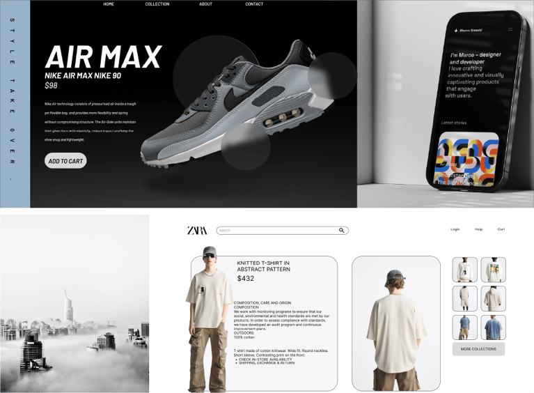
- Sans-Serif Fonts: Without serifs, these fonts have a clean and modern look, suitable for digital text and contemporary designs.
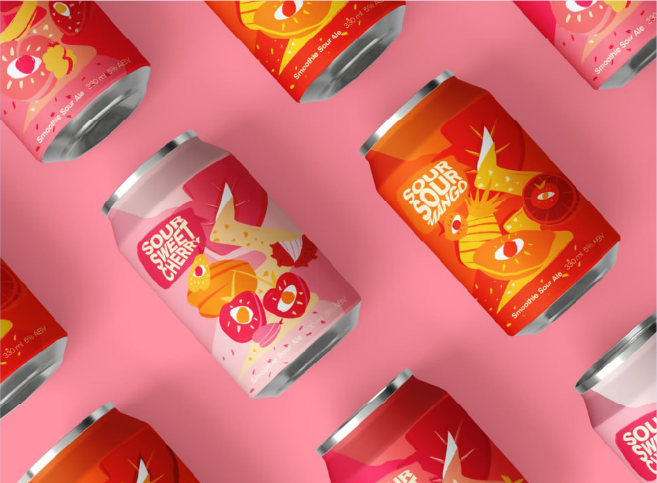
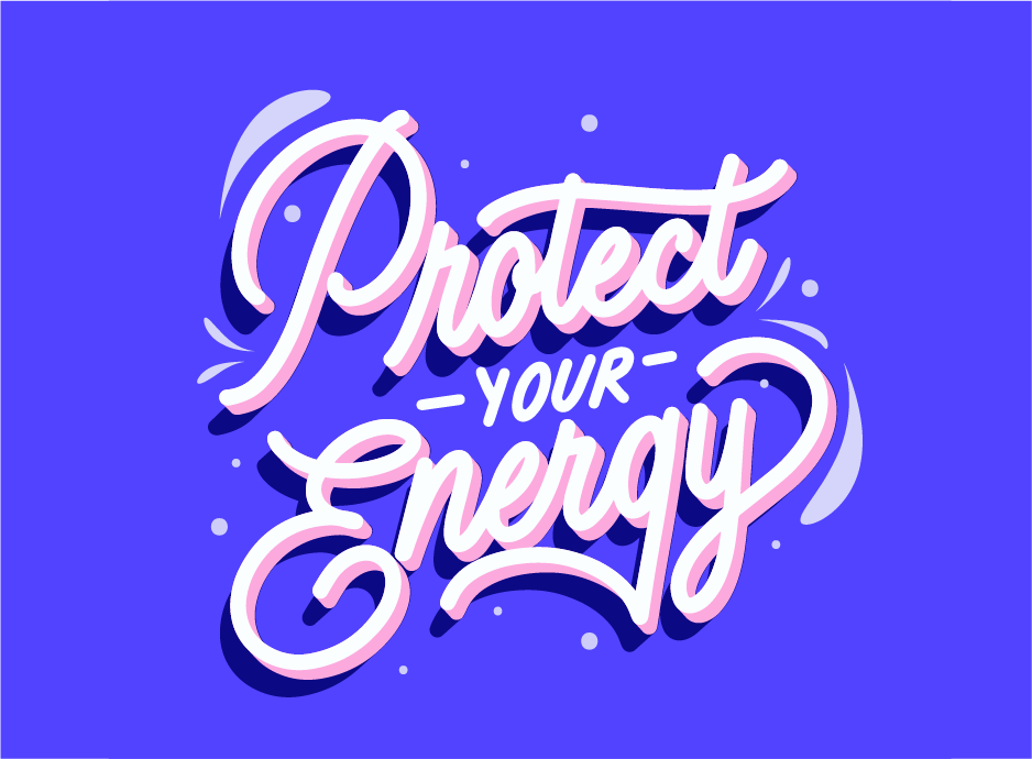
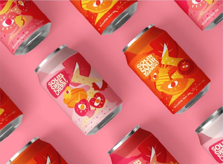
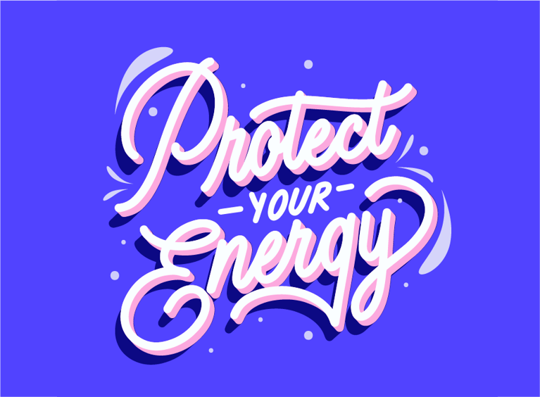
- Decorative Fonts: Designed for impact rather than readability, decorative fonts are often used in logos, titles, and branding for creative emphasis.
Typography and Brand Connection
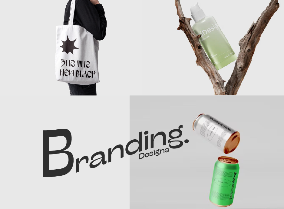
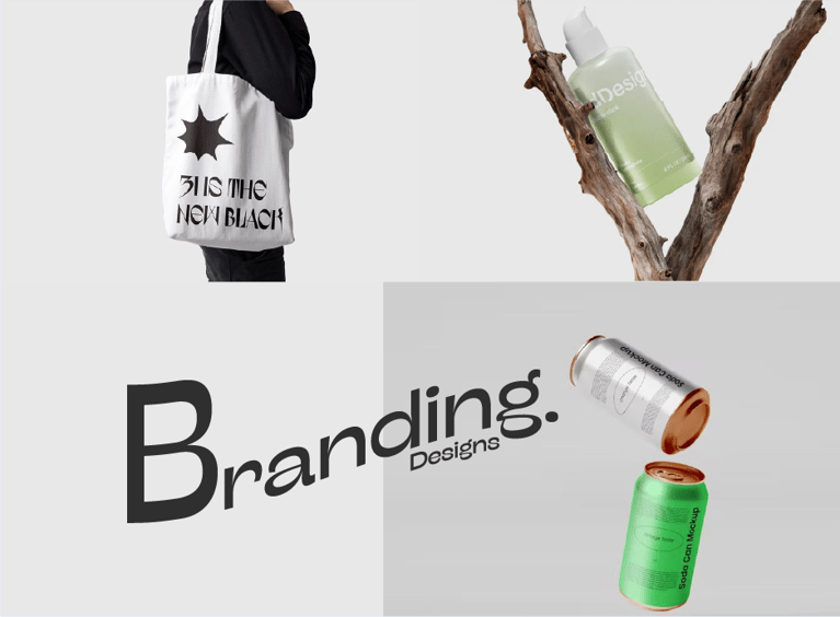
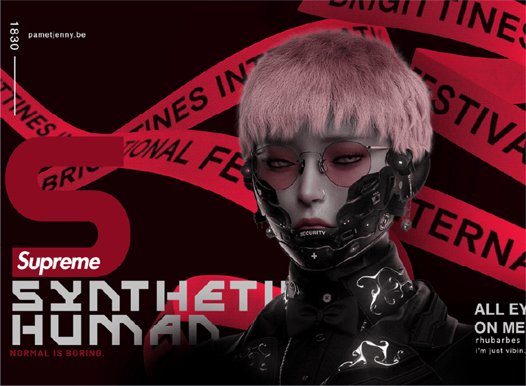
The typeface used in a brand’s logo and materials is often the first impression customers have of the brand. Typography affects how a brand is perceived by conveying its personality, whether formal, modern, or playful.
Best Practices in Typography
Follow these typography tips to make your text more effective:
- Establish a Clear Hierarchy: Guide readers’ attention with heading sizes and styles.
- Limit Fonts: Use 2-3 fonts to keep your design cohesive.
- Maintain Readability: Ensure that text is easy to read, especially at small sizes.
- Balance Contrast and Color: Use contrasting colors and font weights for emphasis without overwhelming readers.
Conclusion
Typography is a powerful design tool that enhances communication and adds visual appeal to text. By mastering typography, you can create designs that are not only beautiful but also effective in delivering a clear message. Whether you’re designing for print or digital, understanding typography will elevate your work and make your content stand out.







.png?width=300&name=small_Chitkara_University%20(1).png)
.png?width=300&name=Clove%20(1).png)




.png?width=146&height=46&name=image%2028%20(1).png)
.png?width=130&height=53&name=image%2027%20(1).png)

.png?width=229&height=20&name=image%2026%20(1).png)









.jpg)









.jpg?width=767&name=movie%20poster%20%20(option%202).jpg)

BOOK A FREE CONSULTATION